Panic in the Streets
Data visualization for food-borne disease outbreaks
client
University of Washington
Role
Data Visualization Designer
focus
Interactive Data Visualization
scope
Research, Design, Prototyping
Problem Statement
How might we communicate various factors like ingredients, location and species related to food-borne outbreak in various states of United States to help users find possible relations and trends?
Key User Tasks
- Track outbreak trends over time
- Identify most harmful contaminants
- Analyze high-risk food preparation locations
- Compare incident control effectiveness by state
- Identify common species/serotypes by region
- Track genotype mortality rates
- Analyze state-wise outbreak vulnerability
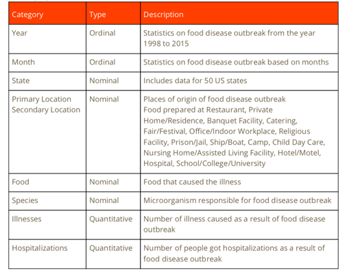
Data Processing
Data Acquisition
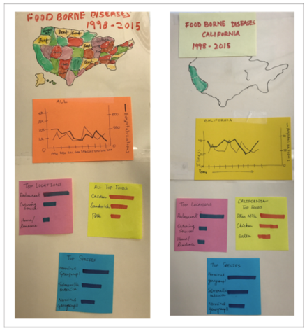
Dataset obtained from CDC's Food-borne Disease Outbreak Surveillance System (1998-2015)
Data Profiling
Categorized data types and improved quality using Open Refine and Excel
Data Preparation
Extracted relevant categories and standardized nominal data
Design Process
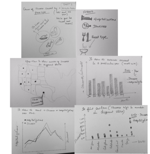
Initial concept sketches and ideation
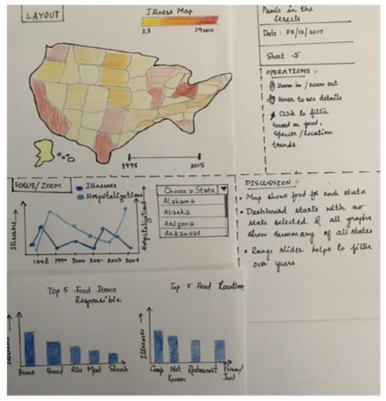
Final concept development

Usability Testing
Testing Approach
Our usability testing process followed a two-phase approach to validate and refine the visualization design. We started with quick guerilla testing using paper prototypes, then progressed to more structured testing with high-fidelity prototypes.
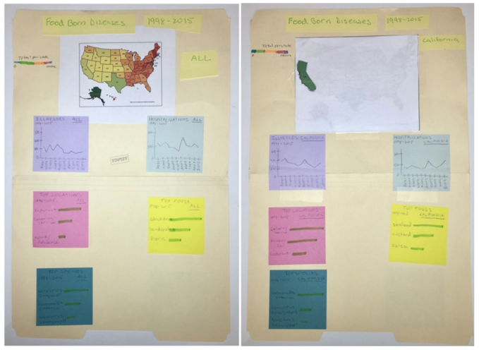
Phase 1: Paper Prototyping
- Quick iterations with low-fidelity mockups
- Early feedback on layout and interactions
- Rapid design modifications based on user input
Phase 2: High-Fidelity Testing
- Detailed interaction testing with working prototypes
- Validation of visual design and data presentation
- Final refinements to improve user experience
Design Principles
Shneiderman's Information Seeking Mantra
- Overview: Storyline approach for high-level understanding
- Relate: Comparison of illnesses and hospitalizations
- Filter: Interactive customization for user needs
- Details on demand: Drill-down capabilities
Future Work
- Integration with live CDC datasets
- Incorporation of preventive measures and reporting mechanisms
- Enhanced data handling with improved infrastructure
- Additional detailed views of specific outbreaks